Sunday, October 23, 2011
Final Submission
Monday, October 10, 2011
Week 12


Draft Text:
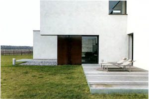
It’s fairly clear that this is a one-sided house. The street-facing side of the house is incredibly bland and featureless, betraying nothing of the intricacies within and beyond.
The back side of the house is much more exposed and implies a design based around the view this face commands. Unfortunately, the location of the house has not been determined, so what the view is actually comprised of, remains to be seen.
Julia W. Robinson: “The distinctive arrangement [of house-plans] seem to reflect three distinct spatial categories and territorial types, public-linking to the outside world, private .relating to community activities within the residence, and intimate activities linked to the individual.”.
The Lubbering Residence is abnormal in that it shuns the public type all together, giving a more intense focus on the private, as evidenced by the communal, exterior spaces at the back of the house, as well as the intimate, with the featureless blocks of space and darkly tinted windows providing an intense level of privacy without sacrificing the architectures aesthetic appeal.
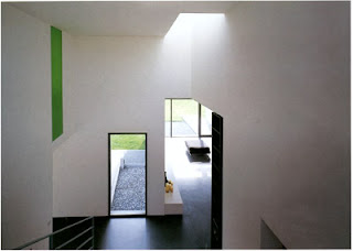
The architecture itself also has an aspect of privacy within itself, presenting a bland facade to the outside world, while providing a well-developed sense of finesse to those who gain access to the building.
There is a connection between the privacy/publicity in the library and the contrast between old and new. The old aspects of the building, namely the books and the bookshelves, give the feeling of intimacy, while the newer elements, such as the furniture and the wall rendering, give an exposed and disconnected feeling.
The juxtaposition between the bamboo shoots, as well as the vines, and the modern architectural style of the building, avoids the problem of the building feeling completely cold and featureless. It also demonstrates the power of nature over the most static and immovable of objects.
There are various levels of privacy throughout the building, from the intimate, almost claustrophobic, areas between bookshelves, to small, group-oriented reading areas, to the public courtyard and the balcony. The movement between these spaces is the driving force of this building, turning what was originally a rather dull, modern house, into a dynamic set of spaces which give the originally static building an interactive aspect. Users of the structure can find a level of publicity which they are comfortable with and tailor their usage of the building to their needs and desires.
The wall surrounding the courtyard plays a pivotal role in defining the experience of the buildings users. It combines with the balcony to give a complete sense of enclosure during the initial stages of entry to the building, it then creates a much more public space in which the user can observe the majority of the building, as well as the violation of that spaces boundaries by the bamboo plant.
Once inside the building, the wall becomes an area to be viewed and looked down on, while still maintaining a reasonable level of privacy. This gives the users an impression of dominance and power, which aids in maintaining a seperation of the various spaces within the building.
Friday, October 7, 2011
Thursday, October 6, 2011
Week 11
Thursday, September 29, 2011
Week 11 Independent
Sunday, September 25, 2011
Wednesday, September 21, 2011
Week 10 Independent
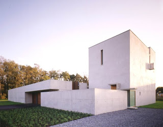
The Opus City by Drewes+Strenge is another fine example of the subversion of the modern architectur style through the use of materials and the importance of location. This building, like the Lubbering Residence, has a distinct emphasis placed on the view, with the forms of the building designed so as not to interfere or distract from these views. The street-facing side of this house, as with many of their buildings, is almost excessively blocky and betrays little of the content, or even the general shape, of the house.
The purpose of this disconnection from public perception seems to be to completely seperate the residents public activities, such as work, shopping, etc, from their private activities. This is reflected not just in the structure of the house, but also in the materials. The public face presents low-grade concrete and rusted steel plates, while the interior and back-facing views consist of high-quality white render and wooden boards.
The building is presented as an industrial extrusion of a biological system, crisp lines and rough materials suggest efficiency and accuracy, contrasting with the flowing green surroundings and the wildness of the trees at the back fence.
The building itself appears as a block punctuated with unnecessary details; excessively thin windows, useless extrusions of concrete, cantilevered platforms which hover a few centimeters above a potential support, these details allow a closer inspection to reveal that the apparent industrialism has been lampshaded through the addition of aesthetic, subtle imbalances in the apparently systematic form of the structure.

 Reference:
Sunday, September 11, 2011
Week 7 + Week 8 Independent
Wednesday, September 7, 2011
Independent study, photo-realistic model.
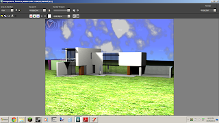

My thoughts at the moment involve re-imagining the building as a more public place, perhaps a doctors clinic or hair salon. This would require re-purposing of most of the rooms and some changes to the exterior. Alternatively, it could be converted into a eating establishment, such as a bar or restaurant. These would require renovation on the interior and some major re-designs of the exterior to include features such as an outdoor dining area or a beer garden. I feel that this building was designed to be used privately, in a private area, for private purposes, and so the most definite change you could make would be to change it into a public building. I thing the most appropriate re-location for this building would be to somewhere near water, perhaps a lake or river, as it has large windows which afford an excellent view.
Sunday, August 21, 2011
Augmented Video
Saturday, August 20, 2011
Tuesday, August 16, 2011
Sunday, August 14, 2011
Sunday, August 7, 2011
Reflection
This project is significantly different to any previous ones I've done, as each step of the process is required before the next part of the design can be created. This means that the initial designs from my designer, the Bjarke Ingels Group (BIG), should (In theory) flow down through the various stages of the design. This is much more interesting than the previous design projects (Such as in ARCH1101) which had no significant starting point and had little relation between the different design stages.
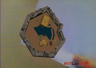
The logical progression BIG claims to use when designing their buildings was my starting point for both initial environments, with the change of space through progression in a building being the underlying theme of the first building. I quite liked the idea, but the implementation ended up looking sparse and dull.
I used the idea of my Spore creatures' habitat as the basis for my second environment, thinking through the various activities he would engage with and the way he would interact with his environment.
I decided to use the second environment, as the first one did not work well as an alternate reality model, being difficult to engage with and unnatural to manipulate. However, the first one still required extensive development to fit onto the idea of the box and to reflect BIG's other significant theme, having simplistic, large designs.
The markers generally took a literal view of the model from their specific aspect, though they required refinement to reflect BIG's crisp, clean-cut style. The design of the box allows the viewer to look into the creatures habitat through a marker set back into the box, giving the implication of a cave, which reflects the cave-like nature of the habitat.


